Archive for the ‘Modern Portfolio Theory related articles’ Category

Surviving Market Crashes Part 4: The global debt crisis

Tuesday, February 7th, 2012

In the previous articles* on surviving market crashes we demonstrated how a market timing modification to Modern Portfolio Theory (MPT) provided asset allocation recommendations that resulted in the investor avoiding most of the losses during these market crashes. Not only that, but in the case of the dot-com bust, the model actually produced a significant positive return.

What is Modified Modern Portfolio Theory (MMPT)?
MMPT is the application of an optimized market timing strategy to MPT which not only produces superior returns but also does so at much lower risk than MPT. The reader is invited to read these articles* to become familiar with the basics of the approach which we call Modified Modern Portfolio Theory (MMPT).

In this article we will be considering the time of global instability arising from the debt crisis in the Eurozone in which we will show that the MMPT constructed portfolio would have significantly outperformed the classic MPT model portfolio.

Global Debt/Recession Fears
The movement of the market is heavily influenced by the uncertainty in the economic environment, and it is this uncertainty that is measured by the volatility index (VIX). Following a spike in volatility in March of 2011 resulting from the tsunami and nuclear plant meltdown in Japan, the volatility settled back down to stable levels below 20. But it began to rise again as both the domestic and Eurodebt crisis came to the forefront on the heels of sovereign debt downgrades heralded by some of the major ratings agencies.

It wasn’t until the end of July that the volatility began climbing to bearish levels (over 25). July 22nd was the last time the S&P 500 (SPX) hit a relative high of 1346 before the VIX took off, sending the S&P plunging 17% in a few short weeks. Following Standard & Poors downgrade of the US’s credit rating, the SPX hit a low of 1120 on August 8th as the VIX concommitantly hit a high of 48. After two months of extreme choppiness, the VIX hit another relative high on October 4th as the S&P put in an intraday low of 1075, representing an overall loss of 20% from its July high. (See charts below.)

Methodology
To compare how a modified portfolio would have done compared with a classic one, the reader should understand the underlying methodology. Both portfolios are made up of the same nine asset classes comprised of domestic and international stocks and bonds along with real estate (in the form of REITs). The model portfolios presented here are designed to return a 10% compounded annual return, the same that was used in the previous articles. The analysis rebalances the portfolios monthly as new total return asset class performance data is made available. The portfolio allocation tool used to conduct these studies for both the classic MPT model and the market timing MPT approach is the SMC Analyzer.

The allocations
During this turbulent time period, an MPT portfolio with a 10% required annual compounded return would have been heavily invested in the stocks of large and small companies both domestic and international (see Table 1). But the MMPT equivalent model (see Table 2) was already light in the large and small stock asset class having benefited from the recent experience of the dot-com bubble and subprime mortgage collapse. Despite some optimism for the alternative international stock and real-estate investment trust asset classes the allocations there were comparatively light, instead heavily favoring medium-term government bonds and the safety of Treasury Bills (or an insured money market equivalent).

Table 1. Classic MPT Historical Allocations During the Subject Period for a Target 10% Compounded Annual Return

Table 2. MMPT Historical Allocations During the Subject Period for a Target 10% Compounded Annual Return
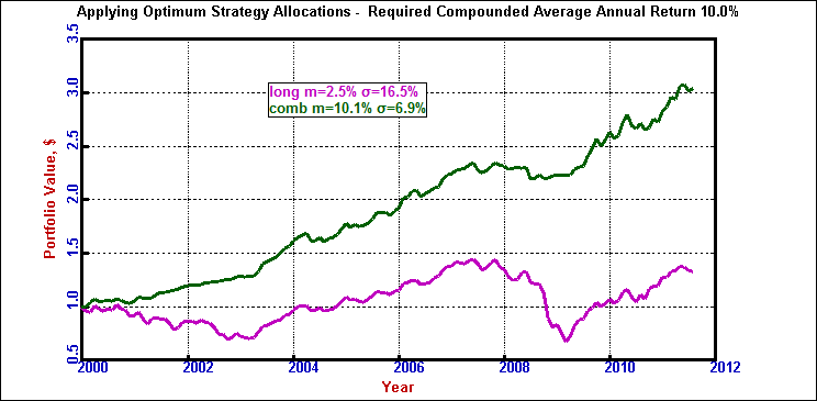
Comparing models
During the months of this mostly fear-driven event, the MMPT portfolio lost at a rate of only 4.7% compounded annually (green line) while the classic MPT portfolio lost money at an annual rate of -40.4% (magenta line). Further, the MMPT portfolio was less volatile. It experienced a standard deviation of only 3.9% while the classic MPT investor experienced a standard deviation of 6.2%.

Figure 1. Comparison of results
(green = MMPT)
(magenta = MPT)

Summary
We have shown that an MMPT investor during the global debt crisis was able to hold onto almost all of his money while most other investors were getting hammered. The reason is that a considered and properly applied market timing approach injects an element of flexibility and responsiveness to a portfolio while still benefiting from historical experience. This is of tremendous value especially in today’s uncertain markets.

Every day the news concerning the uncertainty of the global economy is increasing volatility across most of the traditional asset classes, and it’s for this reason that market timing approaches should be given their proper due. I believe we have shown once again with this case study that the MMPT approach combines the best of Modern Portfolio Theory with the desirability of a viable market timing strategy

For further information on how you can save your portfolio from the ravages of market crashes please visit our website.

*Previous articles on Surviving Market Crashes:
Part I: “Surviving Market Crashes”, August 23, 2011
Part II: “Surviving Market Crashes, Part 2: The dot-com bust”, September 29, 2011
Part III: “Surviving Market Crashes, Part 3: The subprime mortgage crisis”, November 19, 2011

Surviving Market Crashes, Part 3: The subprime mortgage crisis

Saturday, November 19th, 2011

In the previous two articles on surviving market crashes (“Surviving market crashes” and “Surviving market crashes, Part 2: The dot-com bust“) we looked at how Modified Modern Portfolio Theory (MMPT)–an innovative modification to Modern Portfolio Theory (MPT)–provided asset allocation recommendations that resulted in the investor not only avoiding the bulk of losses during market crashes but, in the case of the dot-com bust, actually producing a substantial positive return.

This article is a continuation of the same theme, but here, we’ll be looking at something that wreaked more havoc on portfolio returns than did the dot-com bust—the subprime mortgage meltdown from 2007-2009. We shall show that MMPT-based portfolios again produce superior returns at much lower risk than their classic MPT-based counterparts.

Summary of the MMPT methodology
Since the MMPT methodology was explained in the first two articles, the reader is referred to those for the detailed explanation. Briefly, the approach applies a robust market-timing scheme to Modern Portfolio Theory to determine when one should allocate funds to a particular asset class and when one should take money out of that asset class and place it in the safety of the risk-free asset class (cash, insured money markets, or T-bills).

To illustrate fund performance, nine of the most commonly used asset classes form the basis of the our model investment portfolio: large-cap stocks, small-cap stocks, long-term investment grade corporate bonds, long-term government bonds, intermediate-term government bonds, real estate investment trusts (REITs), international stocks, international bonds, and T-bills (or some other risk-free asset class). Gold and other precious metals are not included for reasons given previously (although we could add it if so desired since we have the gold database).

The devastation of the subprime mortgage crisis
The time frame we’ll be using in this analysis begins on October 11, 2007 when the S&P 500 hit an intraday high of 1576 and ends on March 6, 2009 when the S&P 500 reached its intraday low of 667. This represents a loss of over 57%, more than the 50% loss suffered during the dot-com bust. Figure 1 (which includes dividend income) illustrates just how steep this plunge was.

Figure 1. Total Return Derived from the S&P 500

Along with a steeper loss in the large-cap stocks, the mortgage crisis took a major toll on small-caps as well with similar losses. This was not the case in the dot-com bust where the value of small-cap stocks actually held on despite large price fluctuations.

Figure 2. Total Return Derived from Small Cap Stocks

Table 1 below shows that the annualized returns for all asset classes except for government bonds did poorly during this time period. Comparing these returns with those during the dot-com bust (refer to Table 3 in the previous article), we can see that everything except for government bonds fared much worse during the subprime crisis especially REITs which went from a +7% return to a whopping -54% loss.

Table 1: Annualized total returns of all asset classes during the subprime mortgage financial crisis

Portfolio allocations during the mortgage meltdown
As in the previous articles, we are requiring a 10% compounded return for our model portfolios. Portfolios are rebalanced monthly as new total return asset class performance data is made available. The portfolio allocation tool used for both approaches is the SMC Analyzer.

Table 2 below shows that a classic MPT portfolio would have had roughly 60 – 80% of their assets allocated to equities with the rest divided between REITs and corporate bonds. Table 1 above shows that it is exactly these asset classes that fared the worst during this time period.

Table 2. Classic MPT Historical Allocations During the Subprime Mortgage Financial Crisis for a Target 10% Compounded Annual Return

By comparison, the MMPT equivalent portfolio (Table 3) was already light in the large stock asset class, having benefited from the experience of the dot-com bubble collapse. For the entire period of the subprime meltdown, the MMPT portfolio was heavily weighted (70-100%) towards medium-term government bonds and T-bills with some minor exposure to small-caps and international equities.

Table 3. MMPT Historical Allocations During the Subprime Mortgage Financial Crisis for a Target 10% Compounded Annual Return

As Table 1 shows, it was this exposure to the equity classes that caused the most harm to both portfolios. It’s interesting to note that long-term government bonds fared the best in a so called flight to safety but MMPT did not allocate funds to it instead preferring the historical lower volatility (risk) of the intermediate-term bonds.

Comparison of portfolio returns
During the months of the dot-com bust, the MMPT portfolio lost at a rate of only 1.1% compounded annually (green line in Figure 3 below) while the classic MPT portfolio lost money at an annualized rate of -32.9% (magenta line). Further, the MMPT portfolio was much less volatile. It experienced a standard deviation of only 4.8% while the classic MPT investor was being whipsawed to the tune of 17.3%. Sure, suffering a small loss isn’t desirable but it’s certainly a lot more palatable than losing a third of your holdings. Which scenario would you have chosen?

[As an aside, I attended a conference of public fund and hedge fund managers who actually admitted to losing between 25 and 50% of their funds’ assets during this period.]

Figure 3. Comparison of results
(green = MMPT)
(magenta = MPT)

Summary
We have shown that an MMPT investor during the subprime mortgage financial crisis was able to keep almost all of his money while most other investors were getting clobbered. The reason is that a judiciously and properly applied market timing approach injects an element of nimbleness and reactivity to a portfolio while still benefiting from historical experience. This is of tremendous value especially in today’s uncertain markets.

Every day the news concerning the deterioration of the global economy is increasing volatility across most of the traditional asset classes, and it’s for this reason that market timing approaches should be given their proper due. I believe we have shown with these case studies that the MMPT approach combines the best of Modern Portfolio Theory with the desirability of a viable market timing strategy.

For further information on how you can save your nest egg from the devastation of market crashes, please visit our website.

Surviving Market Crashes

Tuesday, August 23rd, 2011

Introduction: Uncertain times makes investors jittery which can lead to bad investing decisions

Global and domestic debt concerns are making economic markets extremely volatile and investors are scared. After being beaten up by the bursting of the dot.com bubble in 2000, the subprime mortgage crisis in 2007, and the global debt and recession fear crisis now playing out, investors are justifiably fearful about placing their hard-earned coin into companies that may not be around in a couple of years, and many are fearful of losing their nest eggs.

They are facing complex and confusing economic information and are at a loss over how their portfolios should be properly invested. Should they buy gold? Should they divest their stock holdings and use the cash to stuff their mattresses? Will the market turn around soon and if it does, will they be too afraid to enter and miss out (perhaps again) on the ensuing rally?

Investors today have so many questions they can’t answer and many have just given up. But do not fear, help is here! There is a way to stay in the game and still get a good night’s sleep. We’ll show you how.

Asset allocation according to Modern Portfolio Theory: The pros & cons

Many wealth managers design portfolios built upon the concepts of Modern Portfolio Theory (MPT). We’ve discussed MPT many times before, but for those unfamiliar with it, it is a Nobel prize winning mathematical model which tells you how to best allocate your funds among various asset classes while minimizing risk.

Although MPT has revolutionized portfolio management, it is not without limitations. One of the precepts of MPT is that portfolios must always have funds distributed among the various asset classes, in good times and in bad. It is this concept that can lead to large portfolio losses during market corrections—losses that can take many years, even decades, to make up.

How this MPT limitation can be minimized

Realizing the risk of loss during downturns, portfolio managers have sought to downplay the MPT approach by offering their own managed services. It seems that each manager has his or her own approach towards curtailing losses and, typically, the approach is labeled as “proprietary” thus making it opaque to the investor as to how allocations are determined and exactly what components make up each asset class. On top of that, firms offering broad asset class diversification products typically charge a hefty load and/or management fee for the privilege of not telling you how your money is being managed.

When a manager claims that her allocation scheme is proprietary, I have to think that by “proprietary” she means “subjective,” because if her model was completely quantitative, she would say so—what’s there to hide? By contrast, we have created a completely quantitative modification to MPT that will save your portfolio from market crashes.

Market timing meets MPT

We’ve spent a lot of time and effort in developing an effective market timing model that, when combined with MPT, not only offers you higher overall returns at substantially lower risk but saves your portfolio from the devastation of market crashes. The beauty of this approach is that you need only rebalance your portfolio at most once per month. [For more information on how our product, the SMC Analyzer, works and how it can save your nest egg, click here.]

Although we use complex mathematics to determine asset allocations, the theory behind the approach is simple. We apply an indicator that is re-optimized every month for each asset class. When the indicator is positive, we allocate funds to that asset class according to what MPT proscribes. When the indicator turns negative, we take the funds that MPT would ascribe to that class and put it into the most risk-free asset class, typically T-bills (or an insured money market). For this article, we will call our Modified MPT model MMPT for short.

How market timing saved the day

Let’s see how two portfolios, one constructed using the traditional MPT model and one constructed using our market timing model, with the same return objective would have fared over the market crashes from the bursting of the dot.com bubble in 2000 through the current debt and recession fear debacle. Before we do that, though, let’s take a look at the chart of the S&P 500 which shows that the index lost 50% of its value from 2000 to 2002 (dot.com bubble), 57% from 2007 to 2009 (subprime mortgage mess), and 20% (global debt debacle) so far this year (as of this writing).

Monthly chart of the S&P 500


Click to Enlarge

(Click to Enlarge)

Our two portfolios are composed of the same traditional nine asset classes shown below. We are also assuming a target required compounded annual return of 10% which is neither ultra-conservative nor highly speculative. The only difference between them is one enjoys the benefits of market timing, the MMPT portfolio, while the other does not.

    The nine traditional asset classes used in this analysis

  1. Large-cap U.S. Stocks (S&P 500)
  2. Small U.S. Stocks (Russell 2000, etc.)
  3. Long-Term Corporate Bonds
  4. Long-Term Government Bonds
  5. Intermediate-Term Government Bonds
  6. 30-day U.S. Treasury Bills
  7. Real Estate Investment Trusts (REITs)
  8. International Stocks
  9. International Bonds

Both were rebalanced following updated allocations provided each month. Returns from the beginning of 2000 to the end of this July are plotted against each other in the figure below. (The MMPT portfolio returns and stats are given in green; the classic model is shown in magenta.).

Comparison of Portfolio Returns & Risks for the Classic & Market-timing models


Click to Enlarge

(Click to Enlarge)

Discussion

The results show an astounding difference in both returns and risk. The market-timing (MMPT) portfolio was not only able to make its required 10% return but it beat it while the classic model could only return a measly 2.5%, hardly better than the average return of a money market. The one positive thing we can say about the classic portfolio is that it was able to beat (barely) the compounded return of the S&P 500 during the same time period. (Click here to see how the same investment in the S&P 500 would have performed.)

More observations:

  • It took five years for the classic portfolio to break even after the devastation caused by the bursting of the dot.com bubble.
  • Four years after the beginning of the 2007 mortgage crisis, the classic portfolio still hasn’t been able to climb back to its pre-2007 high.
  • The risk as measured by the standard deviation (σ) of portfolio returns of holding the classic portfolio is more than double that of its market-timing counterpart. This fact alone should alarm you.

Conclusion

We have shown that the judicious application of an optimized market timing model to an MPT-constructed portfolio not only results in being able to attain the required return (at least up to a 10% compounded return) but at a substantially lower risk, too. Another great feature of the market timing model is that it does all this without the need for portfolio hedging or other costly risk-reduction techniques such as buying put options – the market timing model acts as its own hedge!

The few minutes a month that it takes to rebalance your portfolio is sufficient to protect your nest egg from the ravages of a market crash. Can your broker or money manager do the same for you?

A few notes on the article from the author

Gold was not included as a separate asset class in this analysis because most people do not hold it in significant proportion to the rest of their portfolio. But we might run the same analysis with it if there’s any reader interest. (We do include gold as an option on our SMC Analyzer monthly email report.)

We were going to go into detail on why the market-timing model outperforms the classic model during market crashes by showing the monthly allocation tables just before, during, and after each crash, but to do so would have made the article much more lengthy and involved. Again, if there’s reader interest, we can provide these data.

It will be interesting to see how the situation plays out during this current global debt/recession fear crisis. When the dust has settled, we’ll update this analysis. I hope your portfolio is mostly in cash or precious metals!

For further information on how you can protect your own portfolio, click here.

Pat Glenn contributed to this article.

The Myth of Diversification

Thursday, July 14th, 2011

Everyone assumes that broad asset class diversification in an investment portfolio is advantageous. The major benefit is to reduce the risk associated with events that can trigger a decline in any one asset class. By holding a variety of asset classes that are mostly uncorrelated with one another, the investor hopes to avoid those catastrophic occurrences that completely wipes out years of gains such as what happened during the credit crisis of 2008. Further, diversification makes financial planning more reliable and predictable by reducing the variations in portfolio performance from year to year.

Simply put, diversification is a sound investment practice.

But exactly how much risk reduction, in actual numbers, is obtained through application of this philosophy? That was the question I was pondering and was wondering if, indeed, asset class diversification is all that it’s cracked up to be.

Let’s find out.

[Disclaimer: First of all, nothing that follows is an attempt to challenge the precept of broad diversification as an indispensable investment tool, so don’t get scared. Consider this analysis to be an exercise in quantitatively determining the relevance of just how much risk can be reduced by adding more asset classes to one’s portfolio.]

Setup

The ideal tool for performing the analysis in this article is Modern Portfolio Theory (MPT). This Nobel Prize winning approach utilizes complex mathematics to tell you how to best allocate your funds among various asset classes to minimize risk.

Risk can be looked at as fluctuations in portfolio returns. In MPT, risk is measured by a statistical term called the standard deviation. It is this quantity that MPT seeks to minimize in recommending portfolio allocations. [The software used in the analyses conducted here is the SMC Analyzer. Click here for more info.]

The portfolios considered here used monthly total return data taken from January 1928 through May 2011 for each of the following ten asset classes:

  1. Large-cap U.S. Stocks
  2. Small U.S. Stocks
  3. Long-Term Corporate Bonds
  4. Long-Term Government Bonds
  5. Intermediate-Term Government Bonds
  6. 30-day U.S. Treasury Bills
  7. Real Estate Investment Trusts (REITs)
  8. International Stocks
  9. International Bonds
  10. Gold

Each of these asset classes are themselves composed of a broad diversification of assets within that class. This article does not address that need, only the benefits of diversification among various classes.

Baseline

The methodology used in this analysis was to first establish a baseline return/risk table using all ten candidate asset classes (Table 1 below). You’ll see that the table contains certain measures of risk defined as follows:

  1. Standard Deviation – statistical measure of portfolio return fluctuation around the target return
  2. Probability of Loss – chance of that portfolio losing value in any one year
  3. Sharpe Ratio – a measure of risk versus reward with larger numbers being better

This baseline data is shown in Table 1 along with the current ten asset class portfolio allocations (through May 2011.)

Table 1. Baseline portfolio incorporating all ten candidate asset classes.

Click to Enlarge

(Click to enlarge.)

Methodology

The next step was to remove each asset class one by one in each of successive rounds and to assess its effect on the measures of risk. At the end of each round we chose to eliminate that asset class that increased the measures of risk the least [sentence corrected]. This was repeated for eight rounds until only two asset classes remained. Eliminations required examination of 52 separate portfolios (10+9+8+7+6+5+4+3).

By using the above measures of risk as our benchmark, asset classes were eliminated from consideration in each successive round in the following order:

  1. International Bonds
  2. Long-Term Government Bonds
  3. Real Estate Investment Trusts
  4. Gold
  5. International Stocks
  6. 30-day U.S. Treasury Bills
  7. Large U.S. Stocks
  8. Either Intermediate-Term Government Bonds or Long-Term Corporate Bonds depending on target return

Results

Tables 2a and 2b show the measures of risk using only two asset classes in the MPT analysis. There are two tables because different asset class combinations are preferable for the most conservative portfolios (target returns up to and including 7%) and the more aggressive ones (target returns 8% and above).

Table 2a. Two asset class allocations and risk measures for conservative portfolios
RequiredStandardProbabilitySharpeSmallMedium-Term
AnnualDeviationOfRatioCompanyGovernment
ReturnLossStocksBonds
5.5%4.6%0.121.191.8%98.2%
6.0%5.3%0.131.1410.1%89.9%
7.0%8.7%0.210.8125.0%75.0%


Table 2b. Two asset class allocations and risk measures for more aggressive portfolios
RequiredStandardProbabilitySharpeSmallLong-Term
AnnualDeviationOfRatioCompanyCorporate
ReturnLossStocksBonds
8.0%12.8%0.270.6234.3%65.7%
9.0%17.3%0.300.5250.4%49.6%
10.0%22.4%0.330.4566.3%33.7%
11.0%27.8%0.350.4082.1%17.9%
12.0%33.6%0.360.3697.8%2.2%
12.1%34.4%0.360.35100.0% 

You can see from the tables that returns are best realized by small-cap stocks and medium-term government bonds in conservative portfolios, and by small-cap stocks and long-term corporate bonds (investment grade) in the more aggressive ones. The inclusion of small-cap stocks especially in the more aggressive portfolios should come as no surprise because it is this asset class that is capable of generating the highest returns over the long haul. In fact, it is because of using only small-cap stocks to generate returns in the two candidate model that returns below 5.5% are completely unachievable (but so are very low levels of risk).

Now let’s see how these results compare to the classical model of using ten asset classes.

Comparison of results

Table 3 presents the risk differences associated with reducing ten asset classes to only two.

Table 3. Risk difference between two and ten asset classes
RequiredStandardProbabilitySharpe
AnnualDeviationOfRatio
Return Loss 
6.0%0.2%0.01-0.04
7.0%0.4%0.01-0.03
8.0%0.4%0.01-0.03
9.0%0.5%0.00-0.02
10.0%0.6%0.01-0.01
11.0%0.7%0.01-0.01
12.0%0.2%0.000.00

Discussion

What this analysis shows is truly astonishing and surprising. You can see that the reduction in the number of asset classes has a relatively insignificant effect on risk. I’m betting few folks would have expected this result!

To summarize all this into one number, you are increasing your overall level of portfolio risk by only about 1 part in 20 by decreasing the number of candidate asset classes from ten all the way down to two. This is based on the general numerical increase in the values of the risk measures as measured from their baselines.

An historical comparison

Looking at this from a historical perspective, let’s see how well a portfolio with only two asset classes would have fared against a traditional portfolio with all ten. Table 4 shows the results of actually following the recommended MPT allocations–with monthly rebalancing–from January of 1928 through May of 2011.

Table 4. Comparison of actual returns achieved utilizing ten asset classes versus two asset classes.
RequiredTen Asset ClassesTwo Asset ClassesDifferences
ReturnReturnSDReturnSDReturnSD
6.0%7.1%7.3%8.0%8.9%0.9%1.6%
7.0%8.2%10.1%9.1%11.1%0.9%1.0%
8.0%8.6%12.6%10.2%13.5%1.6%0.9%
9.0%9.1%14.5%10.9%15.7%1.8%1.2%
10.0%10.1%16.7%11.4%17.6%1.3%0.9%
11.0%10.9%18.8%11.7%19.2%0.8%0.4%
12.0%11.8%19.9%11.8%20.5%0.0%0.6%

 [To read this table, the Return under each model is the actual return the portfolio would have realized at the required return level given in the first column, and SD is the risk defined by the standard deviation.]

Let’s look at an example. To achieve a 10% required compounded average annual return, a ten candidate asset class portfolio would have achieved its goal and would have actually returned 10.1% at a risk of 16.7%. That same 10% targeted return attempted using only two asset classes would have actually produced a greater return, 11.4%, with only a slightly higher standard deviation of 17.6%.

It is interesting to note that the portfolios composed of only two asset classes exceeded their targets more so than their ten asset class counterparts. This is due to the fewer choices available to the mathematics of MPT in its attempts to achieve, at least, the required return while also minimizing the level of risk. But in so doing, the level of resultant risk is commensurately slightly higher.

Conclusion

The takeaway from this article should be to note that it doesn’t take broad asset class diversification to adequately achieve one’s investment goals with a reasonable level of reward versus risk. So all of you lazy Lisas and Larrys out there can sleep easier knowing that your nest egg needn’t be diversified among more than the two carefully selected asset classes discussed above for you to realize your desired long-term return at minimum risk.

There are also some practical advantages of choosing the two asset class approach over the ten asset class model. One is the amount of time and inconvenience it may take to rebalance many asset classes every month. The other, and possibly more important advantage, is the amount of coin you might save in trading fees. That alone could well justify the small increase in risk!

In a follow up article we’ll see if we can get away with reducing the number of asset classes in MPT portfolios that include market timing.

Pat Glenn contributed to this article.

The Effect of Gold in a Diversified Portfolio – Part 2

Monday, June 27th, 2011

In Part 1 of this article (6/13/11) we looked at how including gold as a candidate asset class affected classic Modern Portfolio Theory (MPT) portfolios. We found that gold was only advantageous for the more conservative portfolios and even then only at modest percentage allocations. MPT is, of course, still very much relevant for those with defined financial objectives and long time horizons who wish to minimize the risks associated with achieving their financial goals. The concept of broad diversification among investment classes is a basic and universally accepted precept of sound investment practice.

Nevertheless, MPT does have its critics. Its chief assumption is that the future will be like the average of the past, a point that has been the subject of debate. While in the long haul that is very likely to be true, there will be significant periods of time when that does not hold. Extended bear markets or short term crashes such as those experienced in the last decade can wreak havoc with even properly diversified portfolios that can take many years to repair.

The question now becomes: Is there a way to avoid the bulk of losses experienced during downturns while still benefiting from the periods of recovery? The answer to this is yes, and we’ll see how this can be accomplished.

The application of market timing to MPT-constructed portfolios
What we will be looking here is the application of a cautious market timing modification to MPT. In particular we will examine the effect of including gold as a candidate asset class in the same way as we did in the first part of this article.

Briefly, the approach is to apply a timing oscillator optimized specifically for each asset class. When the oscillator turns positive, a long position is entered into with the portfolio percentage determined by MPT. The position is held (with monthly allocation adjustments as determined by MPT) until the oscillator goes negative, in which case the asset class is liquidated and moved into cash (T-bills, insured money markets, etc.). Utilization of this monthly rebalancing strategy has historically shown to achieve the same financial objectives as classic MPT but at much lower risk. More detailed information on this approach is available here.

Risk comparison between non-gold portfolios with and without the benefit of market timing
Let’s look at some results. Table 3a below shows the current allocations (through April 2011) for market timing modified MPT portfolios without gold as a candidate. Note that the risk associated with each targeted portfolio return (given in column 1) is defined by the standard deviation shown in column 2.

Table 3a. Current Market-Timing Modified MPT allocations without gold

The portfolios in the above table compare to those in Table 1 in Part 1 of this article. The table is reproduced here for your convenience:

Table 3b. Current MPT allocations without gold (no market timing)

An important takeaway from this article is to note that the application of an optimized market timing system considerably reduces risk in an MPT constructed portfolio. At higher portfolio percentages (8% and above), the risk is reduced by 50% or more which is amazing! Additionally, the probability of experiencing a losing year drops as well. In a 10% target return portfolio, one can expect a losing year every six years instead of every three.

Another important point to note is that higher returns can be achieved by using the market timing approach. Compare the top returns in both models: a 12.2% return is the maximum achievable return (at this point in time) in MPT-constructed portfolios with no market timing versus 13.8% in models with it.

Risk comparison between portfolios containing gold with and without the benefit of market timing
Table 4a below shows the current allocations (again through April 2011) for market timing modified MPT portfolios with gold as a candidate. The striking difference from Table 2 in Part 1 of this article (reproduced in Table 4b below) is the prevalence of gold throughout the range of alternative portfolios.

This result tends to indicate that gold is a worthwhile investment component in your portfolio but only if you watch it closely and are nimble and reactive in getting in and out of your positions. However, comparing the standard deviations with those in comparable Tables 3a and 3b above for those portfolios of equal required return, the advantage of including gold as a risk reduction tool is actually quite minimal.

Table 4a. Current Market Timing Modified MPT allocations including gold

Table 4b. Current MPT allocations including gold (no market timing)

A historical perspective
The above tables reflect current allocations and risks associated with MPT generated portfolios. These numbers, however, are not indicative of long-term performance. For that, we need to start at the beginning of our data (January of 1928) and calculate how each portfolio would have done since then.

To that end, let’s return to the conservative 6% compounded annual return portfolios we looked at in Part 1. Figure A below compares the classic MPT approach to the market timing modified MPT approach without gold as a candidate asset class. The lines show the growth of a portfolio following each of these two strategies with monthly rebalancing according to each model’s recommendations. The magenta line is the classic MPT portfolio (repeated magenta line from the graph in part 1) while the green line represents the performance of the market timing approach.

As you can see, both approaches met the target return and in fact exceeded it (7.1% for classic MPT, “long” and 7.3% for marketing timing modified MPT, “comb”). But that is not the important result as both were only trying to achieve a return of 6%. The significant result is that the market timing modified strategy achieved the target with a substantially lower standard deviation than the classic MPT portfolio, 5.4% versus 6.8% (a 20% reduction in risk).

Figure A. Historical comparison of MPT derived portfolios (without gold) for a 6% required return with and without the benefit of market timing


You can see from the above table that over the past 83 years both approaches not only attained but exceeded the required 6% return. The difference is that the portfolio that included market timing did so at approximately a 20% lower level of risk.

Now let’s compare the same portfolios but with the addition of gold. Figure B below shows that again both portfolios met and actually exceeded the targeted return, and again the market timing strategy (green line) did so at an even lower risk (25% lower) than the classic MPT portfolios!

Figure B. Historical comparison of MPT derived portfolios (with gold) for a 6% required return with and without the benefit of market timing

Adding gold increases risk
Comparing the risks from both plots for comparable strategies we see that including gold as an asset class actually caused a 7% increase in risk in the classic MPT portfolios and a 2% increase in risk for the market-timed MPT portfolios, although that was mitigated by the slightly higher returns achieved. Again, the application of market timing decreases the risk in both models.

Summary
From our analysis, we can make the following conclusions:
1. The application of market timing to MPT significantly decreases portfolio risk.
2. The addition of gold increases risk in both models (market-timing vs classic MPT models) but much less so in the market timing model.
3. Higher levels of portfolio returns may be achieved with the market timing model.

Conclusion
The conclusion reached in this article reinforces the conclusion stated in Part 1: There is little to justify gold as an asset class for long-term objective based investments.

FYI: Visit our website for further information on how we apply market timing and how your portfolio can benefit from it, too.

Acknowledgement: Pat Glenn contributed research and analysis to this article.

The effect of gold in a diversified portfolio – Part I

Monday, June 13th, 2011

Introduction
With the continued upswing in the price of gold many investors are once again either wondering if they should buy, sell, or hold the metal in their investment portfolios. This article will examine the contributions made by the gold asset class to a investment portfolio allocated according to Modern Portfolio Theory (MPT).

Used by many fund managers and investment professionals, MPT allocates asset classes according to a desired average rate of return while simultaneously minimizing portfolio risk. Risk can be looked at as fluctuations in portfolio returns; in MPT, risk is measured by a statistical term called the standard deviation.

Because of the broad scope, this discussion is broken up into two parts. In the first part, we’ll compare allocations, returns, and risk in portfolios where gold is included to those portfolios where it isn’t. This comparison will tell us to what extent gold is meaningful as an asset class in a diversified portfolio with a long investment horizon.

In part two, we’ll revisit an article written a couple of years ago to see what effect the recent rally in gold has had on long term returns. We’ll examine it using traditional MPT assumptions and compare the results to those obtained by adding the extra dimension of optimized market timing to see how we can actually decrease risk while increasing returns.

The politics of gold
Our MPT portfolio includes the nine traditional asset classes (see tables below). Monthly total return data from all of these asset classes were only readily available after 1928 which is when we’d like to begin our analysis. We could start later, but in statistics, the more data one has, the more reliable the results.

One problem with this approach is that the price of gold was politically controlled for much of the time between 1928 and the present. In 1933, Americans were prohibited from owning non-jewelry gold and in 1961 they were even barred from holding gold in foreign countries.

Further, the price of gold was fixed in 1934 at $35 per ounce. That changed in 1968 when a two-tiered pricing system separated official transactions at the fixed price while providing for a free market at fluctuating prices. In 1975, Americans were once again allowed to officially own gold as an investment class.

MPT analyses require that data from all asset classes be available for the entire time period with the earliest date being designated as the starting point. Some might argue that 1975 should be the start date since the price of gold was artificially fixed before that. On the other hand, the political nature of gold pricing is a significant reality that should be considered in any analysis. As mentioned above, the performance of the other asset classes is better evaluated using as much data as possible. So, starting the analysis in 1928 has the advantage of including a much larger database from which to predict the performance of asset classes going forward from the present time. [An analysis of portfolios with and without gold using 1975 as the starting date can be found in the July 7 and July 8 articles written in 2009.]

The rise of gold
The figure below shows that one dollar invested in gold in January of 1928 would be worth just over $74 today. [A note on pricing: Gold prices used here are the London Price Fix, the most commonly used benchmark since 1919.]

As you can see, much of the activity has occurred since 1968 when the two-tiered market came into being. The first significant runup in the price preceded the lifting of the legal ownership ban and the second spike accompanied a period of high inflation in the US. Recently, gold has seen a resurgence as confidence in other financial assets has waned.

Current portfolio returns with and without gold
What does this all mean for your portfolio? Should you own gold, and if so, how much? The answers to these questions depend on your risk/return objectives.

Table 1 below shows the current MPT risk/return allocations among the nine traditional asset classes (excluding gold). The average annual compounded rate of returns currently achievable by the MPT model are listed in the first column. The second column shows the risk (standard deviation) which naturally increases along with the required return. Subsequent columns show the probability of portfolio loss in any one year and the Sharpe Ratio which is a measure of return versus risk with higher numbers being more desirable. This table and the next one were derived from the SMC Analyzer portfolio optimization software.

[To use this table, decide which return in Column 1 is right for you, according to your own appetite for risk and your investment horizon. Then, form your portfolio according to the allocations shown in that row. Note that all of these asset classes having corresponding mutual funds and/or etfs that mimic the underlying asset class; for example, the SPY–the S&P 500 etf– could be used as a proxy for Large Company Stocks.]

Now let’s see what effect adding gold as an asset class does to the above allocations. The right-most column in Table 2 below shows the gold allocations as calculated by MPT.

As you can see, MPT allocates gold into only the most conservative portfolios, and then only at modest percentages. Furthermore, the addition of gold provides virtually no risk reduction in those portfolios. This somewhat counterintuitive result supports the conclusion of economist Thomas Sowell who in his book, Basic Economics: A Citizens Guide to the Economy, noted that over time stocks and bonds have produced greater returns than gold.

A comparison of historical returns
The above chart shows that a portfolio constructed for a 6% return has the largest allocation of gold. Using this return objective, let’s compare how a portfolio with gold would have compared with a comparable one without gold. Running the MPT analysis from 1928 to the present, we see from the figure below that while both portfolios actually exceeded their targeted return, the no gold portfolio did so with lower risk (6.8% vs 7.3%).

Conclusion
There is no doubt that over the past few years gold has indeed been a spectacular investment but the data show that growth is sporadic. MPT portfolios are not about producing extraordinary returns in the short term; rather, they are designed to achieve a defined objective return at minimum risk over the long haul.

If you’re a die-hard gold bug who believes that the yellow metal has more room to run, then by all means go out and get yourself some. The moral of the story: Just don’t overdo it.

In a follow up article we’ll look at the effects of gold on a portfolio that uses an optimized market timing approach to MPT to see if we can achieve greater returns at lower risk.

Note: Pat Glenn contributed research and analysis to this article.

The Sharpe Ratio, Part III: Comparison of current portfolio allocations

Tuesday, November 10th, 2009

The Sharpe Ratio, Part III: Comparison of current portfolio allocations

This is the final installment of our discussion of the Sharpe Ratio. Today we’ll see some representative Sharpe Ratios of portfolios allocated according to Modern Portfolio Theory (MPT) using traditional asset classes, that is, stocks and bonds (as opposed to futures or derivative instruments). We’ll also see how adding the element of market timing to classic Modern Portfolio Theory greatly increases the Sharpe Ratio by dramatically reducing overall portfolio risk.

Current Optimally Allocated Portfolios and the Sharpe Ratio
Let’s look at some current (through September 2009) classic MPT allocated portfolios and their Sharpe Ratios. The table below lists the best allocations among a set of nine diversified asset classes. Target returns shown are for the range of possible achievable returns derived from monthly data since 1928. The data reflects compounded annualized returns.

Classic MPT Allocation Table 11-10-09

This table was computed by the SMC Analyzer software available for user subscription on the StockMarketCookBook.com web site. As you can see, the Sharpe Ratios are highest for the lower risk portfolios  predominantly made up of Treasury Bills.  This is rather misleading because as T-Bills have historically averaged those returns, they’re not producing close to the same today. This is one reason to be cautious when evaluating the Sharpe Ratio as the contributing investment return term is backward looking, i.e. what the investment has produced in the past, while the riskless investment return is forward looking, i.e. what U.S. Treasury Bills will pay over the next few months. With this caveat in mind, one can still fairly compare the Sharpe Ratios in the above table since they are all calculated in the same way and over the same time frame.

Note that higher portfolio returns come at the cost of much higher risk (as defined by the standard deviation). By definition, an increase in risk lowers the value of the Sharpe Ratio revealing the declining compensation received for assuming the risks entailed with higher targeted returns.

Market timing improves Sharpe ratio values
Let’s now look at the table for MPT allocated portfolios using the conservative Long/T-Bills strategy enhancement to MPT. In this strategy, the percentage allocated to a particular asset class (equity asset classes only) is normally held Long when that asset class is in a bullish trend. When the trend reverses, the percentage of the portfolio allocated to that particular asset class is transferred into the safety of T-bills. (Trend reversals are determined by an oscillator that is optimized according to a robust and proprietary optimization method.)

The following table was produced using the SMC Analyzer software. In the table, Long/Long is equivalent to the classic MPT approach and is always applied to the bond asset classes.

SMC Allocation Table 11-10-09

The remarkable thing to notice is that it is possible to achieve a long-term rate of return of 10% with a Sharpe Ratio greater than 1.0. Compare that with the meager 0.44 Sharpe Ratio obtained with the classic MPT strategy!

Summary
The Sharpe Ratio can be a useful tool for financial decision making when properly understood and properly applied. As mentioned in Part I, the Sharpe Ratio is not a particularly reliable measure of non-traditional hedge fund comparison because of the non-Gaussian nature of the underlying instruments. What the investor has hopefully learned here is that when properly understood and applied, the Sharpe Ratio can be a legitimate tool for fund comparison but it shouldn’t be the only tool.

Part II: The Sharpe Ratio and Modern Portfolio Theory

Friday, November 6th, 2009

Dogs with sliderules 11-05-09

This is the technical portion of this article trilogy on the Sharpe Ratio so be sure you’re armed with high-water pants and a pocket-pen protector. A slide rule is a bonus.

A little background
Modern Portfolio Theory (MPT) is a Nobel Prize winning financial concept that utilizes mathematical optimization algorithms to determine the best allocation of investments in a portfolio. For a selected desired overall rate of return, MPT will tell you how to allocate your capital among a diversified set of investment asset classes such that the variation in the periodic portfolio total returns as measured by the standard deviation (aka risk) is minimized.

Follow any discussion on MPT and you’ll run into the following graph on the Efficient Frontier:

Efficient Frontier 11-05-09

This technical plot shows the current relationship between desired return and standard deviation. What it shows is that to get a higher return, you’d need to assume more risk (given by a higher standard deviation). The curve known as the “efficient frontier” represents those optimally efficient portfolios that provide the least amount of risk at a given level of return. The shaded area underneath the curve represents the possible space of less efficient allocations of portfolio assets. To obtain a return in the area above the efficient frontier is theoretically impossible with the given asset classes.*

Note that the efficient frontier is a curved convex line. This is a result of the lack of correlation between the various asset classes in the portfolio and how that results in an optimum portfolio characterized by an overall standard deviation less than it would be for one of completely correlated assets. For uncorrelated assets when some are up in value others are down in value and the overall portfolio therefore exhibits reduced variation. For a portfolio of totally correlated assets a combined linearly weighted standard deviation would result and the efficient frontier curve would be straight rather than curved. It is the existence of optimum allocations that pulls the line to the left for a lower standard deviation at each point that creates that convex shaped curve. The end points of the curve do not benefit from this left pulling because they are dominated by single asset class portfolios, at the high end with 100% the riskiest asset class and at the low end by mostly the least risky asset class. The convexity of the efficient frontier curve therefore graphically demonstrates the beneficial effects of diversification.

How the Sharpe Ratio fits into MPT
Let’s look at the line of Best Capital Allocation on the graph above. This line represents the best way to incorporate a riskless cash component into an already optimum portfolio thereby reducing the risk even further albeit at a reduced overall rate of return. On the graph, the annual rate of return on a 90-day T-Bill is about 1.2% (those were the days!). This is considered as safe an investment for the short term as is possible to find and is considered to be as riskless as cash. The line on the graph therefore starts at 1.2% plotted at zero standard deviation (it’s riskless!) and is drawn so that it contacts the efficient frontier curve at a point such that the slope of the line is a maximum. This is the point on the efficient frontier with the greatest Sharpe Ratio and is known as the market portfolio. The slope of the line is the Sharpe Ratio for the market portfolio and the current riskless rate of return. As seen on the plot above, the market portfolio provides about a 5.0% return which has a standard deviation of 3.4%. The Sharpe Ratio for this investment is therefore:

(5.0 – 1.2) / 3.4 = 1.12

which, as we have noted, is also the slope of the line of best capital allocation. Note that the line of best capital allocation is straight because the riskless investment has no standard deviation and there is no better ‘optimum’ allocation that will produce a resultant combined reduced standard deviation that would produce a convex curve like that for the optimum allocations of the other investment classes.

The market portfolio has the unique property that, taken in combination with a riskless cash component, it will produce an optimal return not on the efficient frontier and outside the suboptimal allocation space. It will lie on the line of best capital allocation. The combination will offer a larger return for a given amount of risk than any of the portfolios on the efficient frontier. In this way you can easily construct a composite portfolio that is still optimum but also has a reduced standard deviation. Unfortunately, this comes at the penalty of a lower overall portfolio return. The percentage of cash to include in the composite portfolio is easy to determine since the standard deviation is reduced linearly according to the slope of the line (the Sharpe Ratio).

For example, a portfolio of assets at risk returning 5.0% with a standard deviation of 3.4% can be reduced to one with an arbitrarily selected standard deviation of 2.0%. From the line of best capital allocation on the graph, such a portfolio returns about 3.2% and is constructed by reducing the component of optimally allocated market portfolio risky assets to 64% (3.2 / 5.0) x 100% and by adding a 36% (the rest) riskless cash component. Portfolios on the line of best capital allocation above the market portfolio can only be achieved by adding leverage to the market portfolio financed by borrowing at the riskless rate of return.

Tomorrow’s focus
In the final segment, we’ll look at Sharpe Ratios for optimally allocated portfolios in the current market environment.

*A traditional MPT portfolio allocates funds among the following asset classes: Large Company Stocks, Small Company Stocks, Long-Term Corporate Bonds, Long-Term Gov’t Bonds, Medium-Term Gov’t Bonds, T-bills, REITs, International Stocks, and International Bonds.

Note that the efficient frontier curve will be different assuming a different set of asset classes.

Honing in on the Sharpe Ratio – Part I

Wednesday, November 4th, 2009

pencil-sharpener

I’ve been reading that investment professionals still use the Sharpe Ratio to evaluate fund performance which led me to ask the question of some of my peers as to what they consider to be a “good” Sharpe Ratio. The answers I received were unexpectedly all over the map; some considered anything over 1 to be good. Others thought that only double digit Sharpe Ratios were worth bothering with while still others said that the Sharpe Ratio had no impact on their investment decisions.

This left me even more confused and I decided to explore the Sharpe Ratio in detail so that I could make my own informed decision concerning its validity. To help me in my investigation, I called on Professor Pat as he’s the resident StockMarketCookBook expert on all things related to portfolio theory.

In only two days, he presented me with an exceptional treatise on the subject of the Sharpe Ratio. The only problem I had with it was the length which I felt was too long for one blog so I broke it up into three distinct parts which will be run over the next few days. What follows is essentially his writing with some of my own thoughts tossed in.

Definition of The Sharpe Ratio
The Sharpe Ratio is named after William Sharpe, a 1990 Economics Nobel Laureate who won it for his work on the Capital Asset Pricing Model (known as CAPM) which shows how the market prices individual securities in relation to their asset class. Here the discussion is focused on the Sharpe Ratio which for a particular investment is a direct quantitative measure of reward to risk.

Sharpe devised the ratio which he called the ‘reward to variability ratio’ in 1966. It later became known as the Sharpe ratio as other economists and financial professionals attributed the ratio to him. It is a measure of how much excess return an investment provides over and above a riskless investment (e.g., T-bills) considering the additional risk (σ, the standard deviation of the returns on the investment under evaluation) that is entailed. It is mathematically defined as the following:

Sharpe Ratio = [Investment Rate of Return – Risk-free rate of return] / σ

The Sharpe ratio is there used to assess how well an investment compensates an investor for assuming additional risk. Higher values of the Sharpe ratio are considered to be better than lower ones. The investment community generally considers values over 1.0 to be good, over 2.0 to be very good, and over 3.0 to be excellent, but these can vary depending on the current financial climate. [Note: As of this writing, the risk-free rate is almost zero which means that the Sharpe Ratio is essentially just the investment return rate divided by the investment risk.]

Riskless Investment Returns
The measure used in calculating the rate of return of a riskless investment is typically short-term (90-day or less) U.S. Treasury Bills. This investment is considered to be as safe an investment as you can possibly find, and will exhibit no variation in base value during the holding period. Only the rate of interest will change as the bonds mature and are rolled over.

Other measures of what is considered “risk-less” can produce significantly different Sharpe Ratios. Long-term government bonds are not an appropriate measure for a risk-less security as market interest rate changes can significantly alter their values and in some cases can drive down the total return to very small levels or even produce losses.

Hedge Funds and the Sharpe Ratio
Implicit in the Sharpe Ratio is the assumption that returns on the investment follow a normal distribution (i.e., the bell-shaped curve). While this is a very good assumption for equity based stock index funds that are large and liquid it is not so good for strategically managed hedge funds that employ dynamic trading techniques, illiquid investments, or highly leveraged instruments such as options. For example, a hedge fund strategy that sells deep out-of-the-money options will show a higher than average Sharpe ratio–that is, until the market unexpectedly moves counter to the prevailing trend and the fund is hit with large losses.

Because of the Sharpe Ratio’s mathematical nature, high values must either employ a high return and/or a low risk. As history has shown, high return/low risk situations can’t be sustained for long periods of time.

Here’s an actual example of a supposedly stable fund with a high Sharpe Ratio whose demise nearly destabilized the global financial markets.

In the 1990’s, Long Term Capital Management, the bond arbitrage hedge fund touted as mathematically safe due to the supposed low probability of incurring significant overall losses on its massive portfolio, showed a very high Sharpe Ratio of 4.35. The fund managers employed highly leveraged strategies to make money on small arbitrage spreads. A financial crisis in Russia caused by defaults on government bonds and a resultant flight to quality resulted in massive losses for the fund which controlled nearly 5% of the world’s fixed income market.

Unable to make the loan payments on the huge debt incurred to finance its leveraged positions, they faced collapse. Had they gone into default it would have caused a worldwide financial meltdown. They were bailed out by the Federal Reserve and other creditors and taken over in 1998. So, what else is new?

Hedge fund illiquidity also works to distort the Sharpe Ratio. Investments in real estate, private equity, or mortgage backed securities for which there is no ready market can appear to be less volatile which helps their Sharpe Ratios. Fund managers tend to price these securities in a way that is, of course, favorable to the fund’s statistics and can produce an artificially high value for the Sharpe Ratio.

[Note: Illiquidity relates to how assets are valued. When there is no ready market how do you determine what something is worth? The recent mortgage crisis is an example where fund managers were valuing their own assets arbitrarily. The rate of return on an investment is related to how its value fluctuates. If it does not fluctuate then the standard deviation is low and the Sharpe Ratio is high. If that lack of fluctuation is artificial then the Sharpe Ratio is also artificial.]

Summary
Many hedge funds that currently report a high Sharpe Ratio may be employing strategies that are manageable at their current size but as they grow those same techniques may prove impractical and the Sharpe Ratio could drop dramatically. As a result, the Sharpe Ratio may not always be a good measure for evaluating a hedge fund’s risk/reward relationship.

To get a better picture of a fund’s risk/reward profile, investment professionals look at other aspects of performance including maximum portfolio draw-down and statistical measurements such as kurtosis and skewness. The Sortino Ratio, a modification of the Sharpe Ratio, focuses on downside volatility. Some think that it’s a more accurate representation of hedge fund risk but it, too, is subject to many of the same criticisms as the Sharpe Ratio. As one professor of risk management so aptly said, “Risk is one word, but it is not one number.” [Ref. 1]

Tomorrow we’ll look at the Sharpe Ratio in the context of Modern Portfolio Theory, so dust off your propeller hats!

References
1. “The Sharpe Ratio can oversimplify risk,” Investopedia.com.
2. “Risk gets riskier,” Hal Lux, Institutional Investor, October 2002.

Image by Free-StockPhotos.com

How market timing saves an MPT-allocated portfolio

Tuesday, July 21st, 2009

I’ve been receiving numerous inquiries into the Stock Market Cook Book’s portfolio analytical tool, the SMC Analyzer, which is a powerful software tool that applies proven market timing strategies to Modern Portfolio Theory (MPT). Although Analyzer results have been discussed in previous blogs (see 5/12-13/09, 7/07/09), I feel that some of the points made earlier need to be reiterated.

One of the most frequently asked questions is this:  How did a portfolio based on market timing perform during the recent credit crisis as compared with a traditionally long-only MPT portfolio? Although I’ve already answered this question in the May articles, I decided to update the results to this July and take an in-depth look at how both portfolios would have been allocated on a month-by-month basis beginning in July 2008.

Modern Portfolio Theory (MPT) in a nutshell
Briefly, MPT tries to maximize returns given a certain level of risk. It attempts this by allocating a portion of one’s portfolio over a spectrum of asset classes, each with varying degrees of inter-correlation. For example, an MPT-allocated portfolio would most likely contain the asset classes from both large and small-cap domestic (US) stocks, US government and corporate bonds, real-estate (typically in the form of REITs), and international stocks and bonds. Commodities such as precious metals and oil are also popular asset additions. (Hedge funds can also play a role in portfolio diversification.)

MPT attempts to achieve the desired return via the robustness (that is, the degree of return versus the associated risk) of a particular asset class combined with the degree of correlation (or rather, un-correlation) among the other candidate asset classes. It’s a complex mathematical model for which Harry Markowitz won the Nobel Prize. So far, the theory works well over a very long time-frame, but it does dismally over short, volatile periods because of the requirement that it always must be long in the asset classes determined by the model.

Not so for the SMC Analyzer!

How the SMC Analyzer is different
The SMC Analyzer uses a market timing oscillator that is specifically optimized to each asset class. When the oscillator is positive, it will tell you to be long that asset class; when it turns negative, you’ll be instructed to either go short (if that is what you selected and if that asset class is “shortable”) or else move into the safety of T-bills or another risk-free asset.

So, how did both of these approaches compare over the past year?

Portfolio comparison
Below is a chart that graphically depicts how a traditionally MPT-allocated portfolio would have fared compared with a market-timed portfolio as determined by the SMC Analyzer. In the latter portfolio, it was assumed that when the oscillator for that asset class was negative, those funds that would have been designated by MPT for that asset class would be put into the safety of Treasury bills. In both portfolios, a compounded annual return of 10% is assumed.

timing-vs-mpt-graph-7-21-09

You can see that the tradition portfolio failed miserably—not only could it not yield a positive return but the investor would have been down 26% and at a huge risk of nearly 27%. Note, too, that the maximum draw-down was a whopping 45%, on par with the major averages.

However, had you been in a market-timing adjusted portfolio, not only would you have realized a positive return, but also at greatly reduced risk and without any significant draw-down. This is truly amazing!

To see how these differences in results were achieved, let’s look at the asset allocations recommended by MPT for each portfolio on a month-per-month basis. The top table gives the recommended allocations for the traditional MPT portfolio while the bottom portfolio gives the recommended allocations for the market timing portfolio.

timing-vs-mpt-table-7-21-09

Observations
Here are several observations derived from the above tables:

1. The risk, as measured by the standard deviation of possible returns, is less than half that in the market timing model.

2. The reason that MPT failed so miserably during the recent downturn is because it is looking towards the longer term and it figures that the only way the portfolio will ever be able to achieve a 10% return is by being long in the highest risk (as well as the highest returning) asset classes, i.e., stocks.

3. In contrast, the SMC Analyzer saw that the market was heading down and re-allocated the monies apportioned to Small-Cap Stocks into the safety of Medium Term Government Bonds and T-bills. It wasn’t until March of 2009 that the stock oscillators began to turn positive indicating it was safe again to invest in those asset classes.

4. You can also see that in order to achieve the monthly asset allocations as recommended by the market timing model involves significantly less trades, a plus for those investors who are worried about commission costs eating into their portfolio profits.

Summary
I hope this exercise will put to rest many of the questions that have been raised about the SMC Analyzer’s market timing model. For further information regarding the SMC Analyzer, take the features tour or test drive the Analyzer for yourself. Both are located in the left-hand column of the home page, www.stockmarketcookbook.com.